C
M
Y
K
PANTONE REFERENCE
2635 U
WEB REFERENCE
#B8B0D8
27
29
0
0
R
G
B
184
176
216
C
M
Y
K
C
M
Y
K
C
M
Y
K
PANTONE REFERENCE
274 U
WEB REFERENCE
#4D388D
PANTONE REFERENCE
274 U
WEB REFERENCE
#4D388D
PANTONE REFERENCE
7459 U
WEB REFERENCE
#528E9C
85
88
0
0
85
88
0
0
76
0
11
36
R
G
B
R
G
B
R
G
B
77
56
141
77
56
141
82
142
156
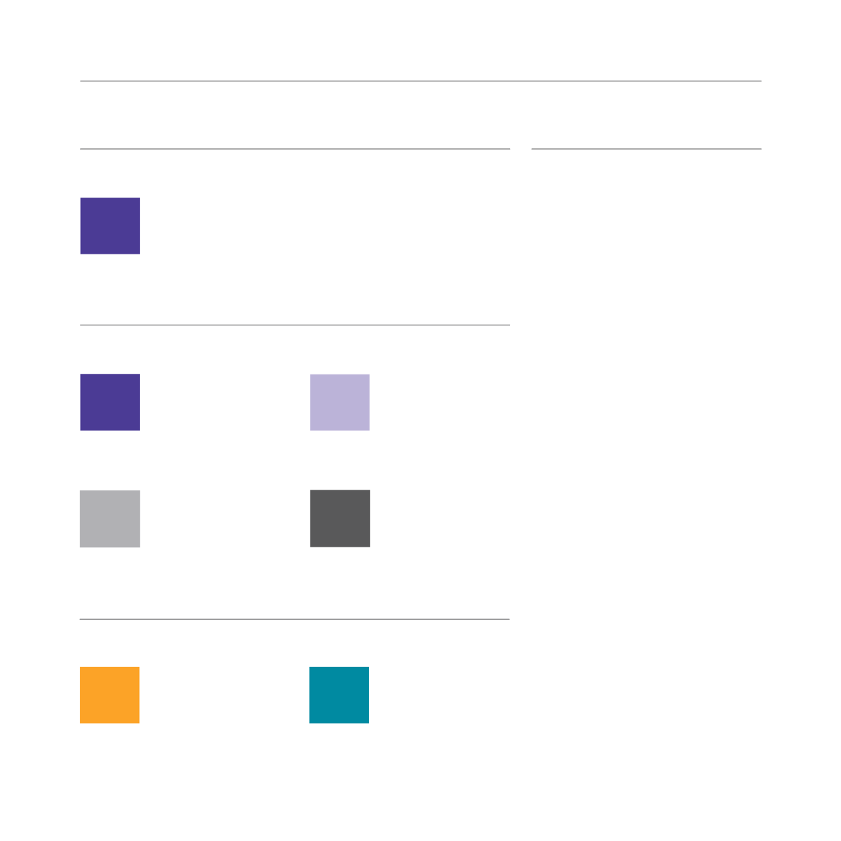
C O L O U R S
P R I M A R Y C O L O U R S
C O R P O R A T E C O L O U R
C
M
Y
K
C
M
Y
K
PANTONE REFERENCE
Cool Grey 5 U
WEB REFERENCE
#A7A9AC
PANTONE REFERENCE
426 U
WEB REFERENCE
#58595B
0
0
0
40
0
0
0
80
R
G
B
R
G
B
167
169
172
88
89
91
S E C O N D A R Y C O L O U R S
This palette of corporate colours has
been designed to complement the
new brand identity and facilitate all
marketing requirements.
The corporate colour is the base for
both the primary and secondary logo
and the starting point for “the wave”.
It is your “go to” colour.
The primary palette consists of the
corporate colour and the finishing
colour of the wave. The suggested
usage is for the “corporate colour”
to be used for titles and type 1
headings and for the second colour
from the primary palette to be used
for sub headings or “call-outs”.
The accompanying greys are to
be used for text on and offline and
as complementary colours to be
used alongside the stronger, more
dominant hues.
For printed documents care should
be taken when using the light grey for
small copy. We recommend using the
darker grey in these instances.
The secondary palette is designed to
be a complementary accessory to the
primary palette and should be used
sparingly to add interest or emphasis
to a particular feature or detail.
C
M
Y
K
PANTONE REFERENCE
7411 U
WEB REFERENCE
#F4AB3F
0
43
100
0
R
G
B
244
171
63
59


