C
M
Y
K
PANTONE REFERENCE
658 U
WEB REFERENCE
#A3C7E9
34
12
0
0
R
G
B
163
199
233
C
M
Y
K
C
M
Y
K
PANTONE REFERENCE
2144 U
WEB REFERENCE
#006FBA
PANTONE REFERENCE
2144 U
WEB REFERENCE
#006FBA
100
52
0
0
100
52
0
0
R
G
B
R
G
B
0
111
186
0
111
186
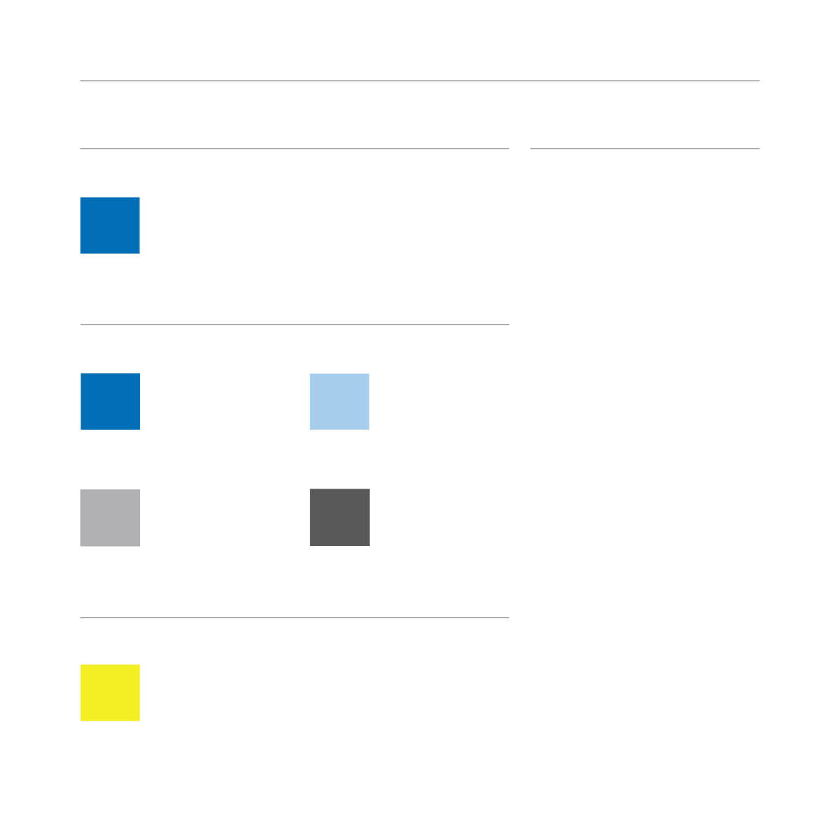
C O L O U R S
P R I M A R Y C O L O U R S
C O R P O R A T E C O L O U R
C
M
Y
K
C
M
Y
K
PANTONE REFERENCE
Cool Grey 5 U
WEB REFERENCE
#A7A9AC
PANTONE REFERENCE
426 U
WEB REFERENCE
#58595B
0
0
0
40
0
0
0
80
R
G
B
R
G
B
167
169
172
88
89
91
S E C O N D A R Y C O L O U R
This palette of corporate colours has
been designed to complement the
new brand identity and facilitate all
marketing requirements.
The corporate colour is the base for
both the primary and secondary logo
and the starting point for “the wave”.
It is your “go to” colour.
The primary palette consists of the
corporate colour and the finishing
colour of the wave. The suggested
usage is for the “corporate colour”
to be used for titles and type 1
headings and for the second colour
from the primary palette to be used
for sub headings or “call-outs”.
The accompanying greys are to
be used for text on and offline and
as complementary colours to be
used alongside the stronger, more
dominant hues.
For printed documents care should
be taken when using the light grey for
small copy. We recommend using the
darker grey in these instances.
The secondary palette is designed to
be a complementary accessory to the
primary palette and should be used
sparingly to add interest or emphasis
to a particular feature or detail.
C
M
Y
K
PANTONE REFERENCE
386 U
WEB REFERENCE
#EBE70E
11
0
100
0
R
G
B
235
231
14
113


